Posted by: aohl | May 5, 2009

Vis Lit Final- Photo Series

http://entertainment.webshots.com/album/571753019SpTSrk

For my final project, I decided to take a series of photos showing the eerie, but beautiful qualities of the running trail behind my house in the morning. While most of the world is rushing down Massachusetts Avenue to get to work, some are sneaking off into the quiet and calm refuge of the Capital Crescent Trail. Its ability to quickly transport Washingtonians and Bethesda residents alike to nature is powerful, but also eerie. I have never felt safe on this trail, yet I am drawn to it.

            The Capital Crescent Trail is what the area calls a “shared use trail.” It goes from Georgetown to Silver Spring, Maryland and can be used by runners, bikers, and rollerbladers. So this trail is a great opportunity for photography.

            I decided to take my photos early in the morning because the low, natural lighting only adds the eeriness- the feeling I associate with this trail. Also, because the trail seems never-ending I thought the low light would add the quality of loneliness. Taking pictures in the sunshine would have clashed with the mood of the trail.

            Throughout my picture series, I tried to incorporate the elements of design and photography we discussed throughout the semester. I find it hard to capture nature. Taking three dimensional organisms and transferring them to paper is challenging. I took photos using symmetry, low angles, zoom, wide angles, and framing devices. This combined, with the intentional use of darkness; I aimed to re-create the eerie little path off Massachusetts Avenue that I have grown to love.  The concept was inspired by Annie Leibovitz’s picture of Scarlett Johannsen as Disney’s Cinderella. I loved the eeriness of this photo.

Posted by: aohl | April 3, 2009

Commerical Review

            When I think of good commercial, my mind immediately recalls Super Bowl advertisements. This sporting event has turned into the crème de la crème event for clever commercial, and with the cost of producing a recent Super Bowl ad, it ought to be. A good Super Bowl commercial was produced in 1998 by the Tabasco Sauce Company.


            The plot of the commercial is simple; a sweaty man is outside on his rocking chair chowing down on pizza. The man keeps pouring Tabasco on his pizza, clearly enjoying the added taste. Then annoying, buzzing mosquito flies up and bites the man. However, he does not react. Audiences watch as the mosquito draws blood and flies away. The creative part comes in when the mosquito explodes, implying how spicy Tabasco is.


            This commercial is clever because it is memorable and promotes Tabasco Sauce, without making it the centerpiece of the commercial. In addition, the visual are creative as well. The commercial uses a wide variety of shots to enhance the overall effect.


            To show the main character, the camera pans in on him close up. This angle is effective because it gives viewers a good look at the man, what he is eating, and how sweaty he is. A close-up angle is also effectively used in the scene where the camera closes in on the man’s pizza, to show that he is dowsing it with Tabasco. Without this scene, the product would not be promoted and viewers would have a harder time understanding why the mosquito exploded. Lastly, the camera closes in during the mosquito bite scene, zooming in so close you can see the man’s intricate skin pattern. This helps clarify the plot.


            The lighting also helps the commercial’s effect. Bright lights are hung from the top. This not only acts as a spotlight on the pizza, the man, and the sauce, but also creates an accurate representation of how porch lighting would be. If the lighting was elsewhere the scene would seem unnatural.


            Overall, I think the commercial is very memorable and well-produced. It could be improved with the background noises. I think buzzing and “nature noises” sounds synthesized and are too loud. Other than his semantic detail, Tabasco has created a great Super Bowl commercial.

Posted by: aohl | April 1, 2009

Music Video Review

A music video that always struck me as interesting is Jimmy Eat World’s “The Middle” video. The video is enhanced by a variety of camera angles, an interesting plot, and a great use of low lighting. The overall effect compliments the video’s mood and lyrical meaning.

            “The Middle” begins with a girl getting out of her car, approaching a house and taking off her jacket, only to reveal she has no clothes on except underwear and a bra. The girl walks into a raging house party, where Jimmy happens to be playing and everyone else is also dressed in only bras and underwear. The camera angles in these scenes are interesting because they follow the girl through the party as she gets drinks, etc. However you only see her backside and not her face and expressions.

            The next scene features a boy who arrives fully dresses, and immediately feels like an outcast. By contrast, the camera follows him from a front view and shows his face and emotions as he wanders through the party. Viewers get to witness, as he does, ridiculous scenes like a couple making out in a refrigerator and people jumping into a pool. Throughout the video it cuts to the boy, still dressed and lonely, which highlights the song’s lyrics of “you are in the middle, everything will be alright.”

            The lighting throughout the video is very dim. It gives a concert feel, but also plays to the dirty and chaotic nature of the party. If the lighting was different, the entire feel of the video would be thrown off. The only time the video uses some light is when the cameraman goes underwater to show all of the people crowded in the pool.

            The last scene of the video shows the dressed boy reluctantly goes to a room and begins to undress. At the same time, a girl is symmetrically undressing in another room. At the same time they both decide not to succumb to peer pressure and re-dress themselves. The couple leaves arm and arm.

            By using contrasting camera angles, complimentary lighting, and a plot that lends itself to the lyrics, Jimmy Eat World created a memorable music video.

Posted by: aohl | March 25, 2009

Movie Film Review

Saving Private Ryan

Saving Private Ryan


            The film Saving Private Ryan follows the task of Captain Miller, played by Tom Hanks, to find the only surviving member of the Ryan Family after the Allies take the Normandy Beaches on D-Day. The other male members of the Ryan family have been killed in the line of battle, so the military attempts to go behind enemy lines to preserve the remaining member.


            The most memorable part of the movie it its beginning when director Steven Spielberg reenacts the Normandy invasion. What I like most about these scenes is the realism. Apparently, Spielberg went to great lengths to be accurate about the invasion’s appearance and feel. To help with this cause, he uses handheld photography. For me, the handheld approach gave a much more personal feel and the actual shaking of the camera gave a much needed rhythmic motion—as if soldiers were running and breathing. 


            Another aspect the movie succeeded in overwhelmingly was the effect of the colors used. Obviously, wars are ominous- any amateur producers know not to shoot using bright, happy colors. But Spielberg and his cinematographers put in extra effort. As Hanks and his crew are traveling to find the illusive Ryan, they themselves are wearing dark blues, greens, and grays but also the towns they pass are colored ominously. This adds to the overall feeling on uncertainty, and conveys to viewers that the journey ahead is not easy. The coloring also contributes to the historical timing of the war. It succeeds as being “an old war movie” without being filmed in a grainy, black and white perspective.


Lastly, while researching this movie, I came across a website (www.deep-focus.com) that pointed out something I myself failed to see. Saving Private Ryan begins and ends with the same scene: an American Flag. While I realized this, I had not realized the flag is “blasted out,” as Deep Focus points out. Spielberg is a master at creating good plots, but infusing deeper meanings into even the most complex of them. Any good director not only entertains audiences, but sends them home with a parting message.


Obviously, Saving Private Ryan is a compelling movie. It takes the emotional setting of D-Day and personalizes to an individual level. Yet, the film also succeeds in many technical ways. It employs effective camera techniques, incorporates effective imagery through a particular color pallet and infuses deeper meaning into the plot.

Posted by: aohl | February 28, 2009

Spiderman 3- Movie Poster Review

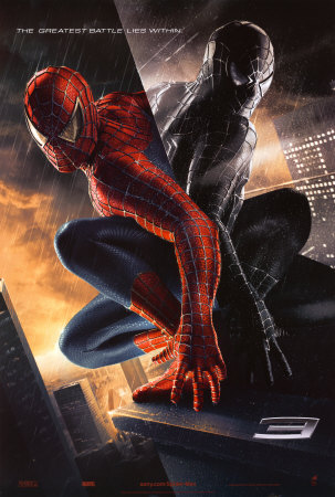
Spiderman 3 Movie Poster

Spiderman 3 Movie Poster

            I am reviewing the movie poster for “Spiderman 3.” Even though this movie is relegated to the category of ‘summer blockbuster,’ a lot of care and meaning was put into this poster. It incorporates the concepts of symmetry, uses both the foreground and background, and has a tagline that plays off the movie’s meaning.


            The symmetric qualities of the poster are more obvious. Spiderman is webbed to the side of a building, where his figure is being reflected off the building. While visually pleasing, the symmetry has more meaning. Like most superheroes, Spiderman must play a dual role, one as superhero and the other as average Peter Parker. Interestingly, the reflection of Spiderman is much darker, implying to viewers different emotions or eluding to bad things to come in the movie.


            The foreground and background of this poster are also worth discussing. While the foreground is dominated by Spiderman and his reflection, the background provides added details. It appears that the skyline in the background is a bright orange, complimenting the blue colors of Spiderman’s superhero attire. Also, the background skyline appears to be smoking. This could suggest to readers a severe event or storm, heightening suspense.


            Lastly, now that we have discussed text and its importance, I wanted to draw attention to the poster’s tagline: “The greatest battle lies within.” As previously mentioned, superheroes are forced to play a dual role. This tagline not only plays well of the poster’s symmetry, but also suggests what Spiderman/Peter Park will be facing in the movie. The text is just as important as the graphic images, because it too determines the message viewers will walk away with.

Posted by: aohl | February 24, 2009

            When I think of title sequences, I immediately think of the James Bond series. These title sequences are notorious for combining fluid motion perfectly to music, in a colorful way. The particular Bond sequence I am reviewing is 1995s “Goldeneye.”


            This title sequence does not have lines in the same sense as the Dexter title sequence we watched in class; however it does cleverly incorporate lines. The first minute of Goldeneye’s title sequence has fluid lines. Audiences trace through the barrel of a gun, first flowing through it and then reversing out as a bullet is show. Additionally, in other clips of the sequence the lines come from the body motions of the dancers in the background.


            Another great attribute of James Bond title sequences is the coloring. Again, in the first minute of the title sequence the screen is covered by trickling blood, as presumably Bond has killed someone. Later in the sequence, vibrant orange and yellows flashes occur as bullets and explosions are going off. The sequence ends with a crisp purple sky fading into blue. All of these colors capture the audience’s attention, especially on a larger screen like a movie theatre screen.


            This title sequence also masters repetition. As in all James Bond sequences, the background is constantly being flooded with symmetrically moving female figures. Goldeneye even includes a sequence of repetitive, cascading bullets. The repetition familiarizes the audience with the plot, and makes the sequence more graphically stimulating.


            Lastly, the texture of the title sequence is intriguing. Because of the realistic graphics, audiences can see the texture of the explosion- meaning the clouds of smoke and force behind it. The barrel of the gun, shown in the beginning of the sequence, is also produced to give a metallic and smooth feel.


            The combination of the fluid lines, repetition, and texture makes Goldeneye a great title sequence. It combines the right amount of motion and stimulation, without being overwhelming. Sometimes simple things, like putting a bullet in the foreground and background can make a sequence, without being too much.

Posted by: aohl | February 17, 2009

Photographer Review

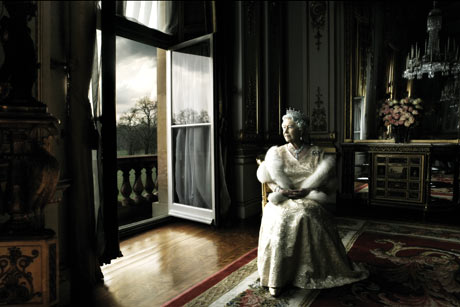
leibovitz460-the-queenleibovitz-cinderella

Annie Leibovitz is an American photographer, notorious for her celebrity photos, most often featured in magazines like Rolling Stone or Vanity Fair. Leibovitz has photographed icons like John Lennon and Yoko Ono, Queen Elizabeth, Demi Moore and LeBron James.


What is most alluring about her photos, besides who is in them, is how Leibovitz uses lighting to dramatize her subjects. For example, in her photo of Queen Elizabeth, the light source comes from the left side of the photograph. It casts shadows, but lights up the Queens face. The combination making the photo more interesting and hints at deeper themes.


Another photo of Leibovitz’s that utilizes lighting well is the photo of Scarlett Johansson as Cinderella. The background of the photo, which includes Walt Disney World, is illuminated and magical. In contrast, where “Cinderella” is running to is dark and ominous.


This photographer also incorporates interesting depths of field into her photos. The background and the foreground are both necessary as they provide details and give her photos more character. Without the open window or the Magic Kingdom in the background both of Leibovitz’s subjects would be missing crucial details to their story lines. In essence, she wastes no space to paint a fuller picture of her subjects.

Posted by: aohl | February 9, 2009

Single Photo Review

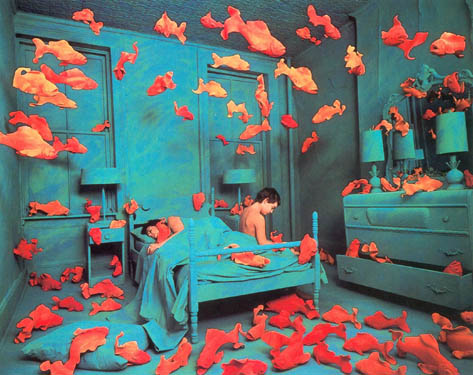
"Revenge of the Goldfish"

"Revenge of the Goldfish"


The photo I chose is review is “Revenge of the Goldfish” photographed by Sandy Skoglund in 1981. Skoglund is an American photographer who creates surreal scenes by incorporating vibrant colors and interesting objects.


Skoglund’s photos and this one in particular draw a viewer’s eye because of her usage of complimentary colors. She uses blue-greens and red-oranges to contrast the underwater scene with the goldfish. Furthermore, she creates subtle textures by using analogous colors to enhance the background scenery. Her combination of color and texture cements her surrealist intentions.


The photo also has intriguing camera work. Skoglund’s depth of field gives the photo a more fish bowl feel, despite not using a fish eye lense. Another interesting thing to point out is the shadowing. By including shadows from the fish sculptures, and creating a darkness in the right side of the photo, it is becomes more comparable to an ocean floor.


A lot about this photo works. While the color pallets of blue-green and red-orange are common, the combination of them creates a surreal and unique feel. Visually, by using gold fish with children sleeping, viewers are not immediately sure of the photo’s purpose. There are also things that could be improved with Skoglund’s ‘revenge.’ For me, the skin tones of the children do not contrast enough with the fish color. An additional contrast would have been more appealing.

Posted by: aohl | February 3, 2009

The Motion of Symmetry

symmetry1-0031

Posted by: aohl | February 1, 2009

Bottled Water has the Blues

bottled-water


The “Another Bloody Water” brand has hit the Australian market. This brand has quickly gained buyer’s attention through their humor and apparent good product. A.B.W.’s unique approach to their bottled water’s appearance is what initially caught my eye. The ad makes for an interesting visual and smartly connects it to the company’s overarching stance.


            In the United States, most bottled waters use varying colors blues and images of waterfalls and “all natural springs” to convince buyers of their worth. Bottled water companies take great effort into displaying their water as the most fresh, most soothing, and most natural by playing off the relationship between colors and their association. However, Another Bloody Water took this theory and threw it out the window. What is interesting about this advertisement is that, minus the minimal text, the bottle sports no color or cascading waterfalls. Not only does this play to their company theory, but visually it set them apart from the Fiji and Aquafinas of the world.


            Another attracting quality to this image, and subsequently the product is the text placement. Other water companies prominently display their logo and name all over the bottled waters in a bold, important text. By contrast, A.BW. uses all lower case, white letters and does not dare to make the letters over power the product. In this case, the understated qualities of the text are a positive.


            Besides just going against the world of water bottles, A.B.W.’s design goes against theory as well. If you divide the ad by the rule of thirds, and finds the most interesting points, the bottle or label is on none of the points. This is not to say that an advertisement must do that, but it is curious as to why the photographer did not play with angles to make the label more alluring to the eyes, according to the rule of thirds. Furthermore, the shot’s point of view seems to take a more direct approach as opposed to a left or right of center approach. Despite breaking two cardinal rules, the advertisement is still effective.


            The advertisement relies heavily on photography. Simply put, the advertisement is three bottles of water sitting on grass. Yet, certain effects perfect the image. For example, the photographer’s depth of field enhances the image. The grass in the background is not in focus like the grass in the foreground. Additionally, the light source is coming from one side of the water, and allows the photographer to catch shadows.


            While I do not know a lot, if anything, about visual literacy, I have realized from the readings and first lecture that photography rules of thumb are great guides. However, when they can be effectively broken, the image that a photographer is trying to capture can be greatly enhanced. With that being said, go have another bloody water.

Older Posts »

Categories